Behavior Reference
The Behavior configuration manages the global settings that dictate how a survey functions and appears to respondents. The interface is divided into three primary tabs: Accessibility, Layout, and Style.
Accessibility
The Accessibility tab governs the specialized interaction modes available to respondents.
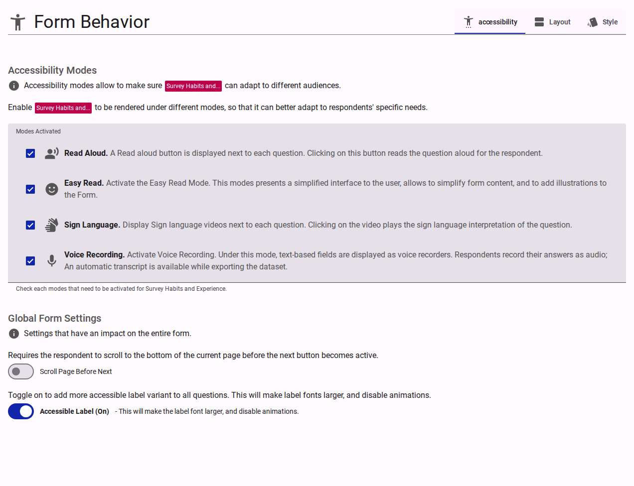
Modes Activated
Defines which optional accessibility adaptations are available for respondents to toggle:
- Read Aloud: Enables text-to-speech functionality for survey questions and responses.
- Easy Read: Activates a simplified interface designed to reduce cognitive load, supporting simpler text and illustrations.
- Sign Language: Enables the display of embedded sign language video interpretations for each question.
- Voice Recording: Replaces standard text inputs with an audio recorder, allowing respondents to reply verbally.
Global Form Settings
- Scroll Page Before Next: When enabled, requires respondents to scroll to the bottom of the current page before the "Next" button becomes active. This is only enforced on their first visit to the page.
- Accessible Label: Toggles a high-visibility, accessible variant for all form labels. Activating this increases the label font size and disables related animations to improve readability.
Research & Integrity
- Behavioral Tracking: Enables the collection of anonymized behavioral signals (e.g., time spent on questions, focus events, interaction frequency). This data is used to calculate the Confidence Index and perform interaction analysis.
- Monitor Drop-off: When enabled, the system automatically analyzes stale sessions to identify where respondents abandon the survey.
- Summary Generation: A summary of progress and behavioral patterns is generated when a respondent is inactive for more than 2 hours.
- Auto-Integration: After 3 days, "dropped off" surveys are automatically integrated into the main survey dataset (similar to a "forced submit"). These entries are marked with a
isDropOffflag for researchers to identify them.
Layout
The Layout tab determines the structural flow and media presentation of the survey.
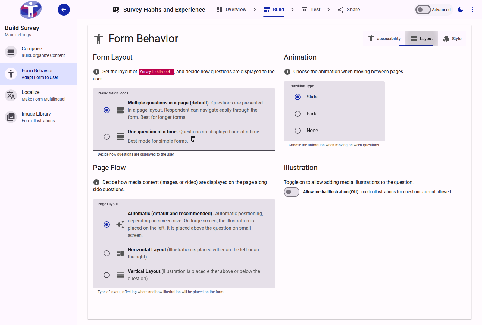
Form Layout
- Presentation Mode:
- Multiple questions in a page (default): Presents standard, scrolling page layouts. Best for longer forms.
- One question at a time: Displays a single question per screen to minimize distraction.
- Transition Type: Defines the animation used when navigating between questions or pages (Slide, Fade, or None).
Page Flow & Illustration
- Page Layout: Determines the automatic or explicit positioning (Horizontal or Vertical flow) of illustrative media relative to the question text.
- Allow media Illustration: Enables the capability to attach images or videos to individual questions.
- Preserve Media Space: When enabled, the layout reserves empty space for media even on questions without illustrations, ensuring consistent vertical alignment across the form.
Style
The Style tab provides a token-based design system to fine-tune the survey's layout and typography. Styling is organized into three hierarchical levels: Base Tokens, Mobile Overrides (applied below 600px viewport width), and One Question At A Time Overrides (applied only when that specific presentation mode is active).
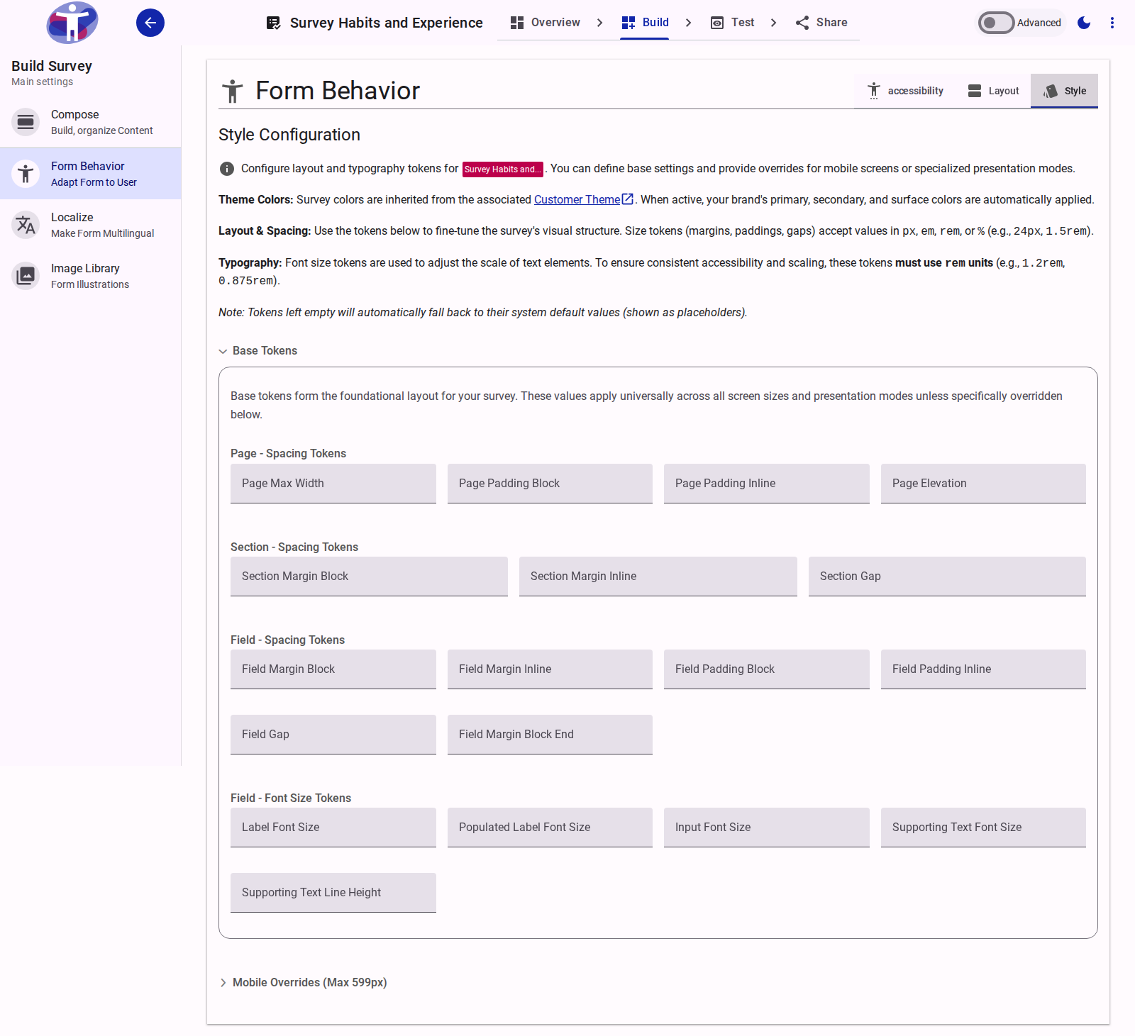
Available Style Tokens
The following layout and typography tokens can be configured. Size tokens accept standard CSS units (px, em, rem, %). For an in-depth look at how these behave, see Understanding CSS Units. Typography (font size) tokens strictly require the rem unit.
Form Tokens
| Token | Description |
|---|---|
| Form Margin Inline | The horizontal (left and right) margin applied to the entire form container. |
Page Tokens
| Token | Description |
|---|---|
| Page Max Width | The maximum allowable width of the survey page container. |
| Page Padding Block | The vertical (top and bottom) padding inside the page container. |
| Page Padding Inline | The horizontal (left and right) padding inside the page container. |
| Page Elevation | The depth/shadow level of the page container. Accepts integer values from 0 to 5. |
Section Tokens
| Token | Description |
|---|---|
| Section Margin Block | The vertical margin separating distinct sections. |
| Section Margin Inline | The horizontal margin applied to sections. |
| Section Gap | The spacing between elements within a section. |
Field Spacing Tokens
| Token | Description |
|---|---|
| Field Margin Block | The vertical margin applied outside individual fields. |
| Field Margin Inline | The horizontal margin applied outside individual fields. |
| Field Padding Block | The vertical padding applied inside the boundary of a field. |
| Field Padding Inline | The horizontal padding applied inside the boundary of a field. |
| Field Gap | The internal spacing between distinct elements inside a field (e.g., between the label and the input). |
| Field Margin Block End | The explicit bottom margin applied below fields to separate them from the next element. |
Field Typography Tokens
| Token | Description |
|---|---|
| Label Font Size | The size of the primary question label text. |
| Populated Label Font Size | The size of the label text when the field is populated or actively focused (typically smaller than the base label). |
| Input Font Size | The size of the text typed into input fields or displayed as answer options. |
| Supporting Text Font Size | The size of helper text or error messages displayed below the field. |
| Supporting Text Line Height | The line height applied to multi-line supporting text to ensure readability. |